Principles of Design: Balance
Since the ability to balance is essential to navigating a gravity-bound world, humans naturally seek balance. It is an instinctual way to bring order to existence. Balance, like unity, is a quality that you instinctively look for and recognize when you view a design or a work of art. A work that lacks balance makes you feel uneasy and dissatisfied. When you recognize balance, you feel a sense of resolution and satisfaction.
To achieve balance, the designer equally distributes the visual weight of items in the design. The type of balance in a particular work can be:
• Horizontal: to the left and right of a center line (like a see-saw)
• Vertical: above and below a center line
• Radial: radiating from a center point, like a sunburst (this creates a strong central focal point)
• Crystallographic: allover repetition of like objects with no distinct focal point (like a chessboard or quilt)
To get a better idea of horizontal balance, picture a vertical line that equally divides “View of Arles” by Vincent Van Gogh:
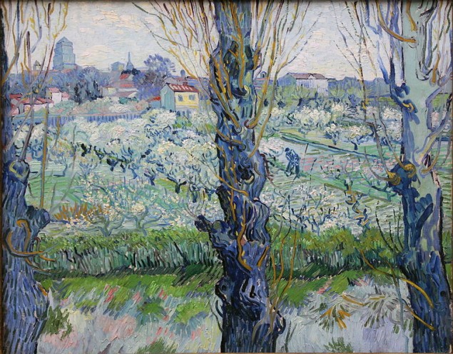
The centerline would correspond to the middle tree trunk. Additional trunks to the right and the left balance the center. In the background, the orchard trees also balance both halves of the painting. Further back, the groups of buildings, although not identical, also provide horizontal balance, as do the sections of sky.
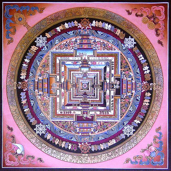
In a vertically balanced work, the upper and lower halves of the scene would balance each other. In a radially balanced design, the objects balance around a center point, like in the Tibetan mandala below:

This particular example has vertical and horizontal balance too, which is appropriate since the mandala represents the universe.
Crystallographic balance relies on the repetition of equally weighted elements in an allover design:

Many fabric patterns, such as a houndstooth or a floral print, have crystallographic balance.
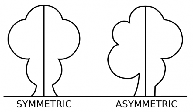
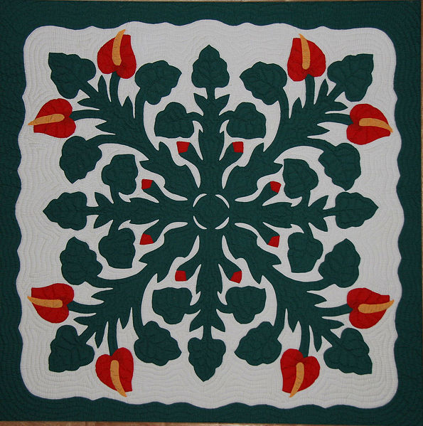
Balance can be symmetrical or asymmetrical. A design that relies on repetition of similar objects, lines, colors or shapes is symmetrical and formal. The arrangement of objects on one side of the work mirrors the arrangement of objects on the other. Most quilt patters are symmetrical:
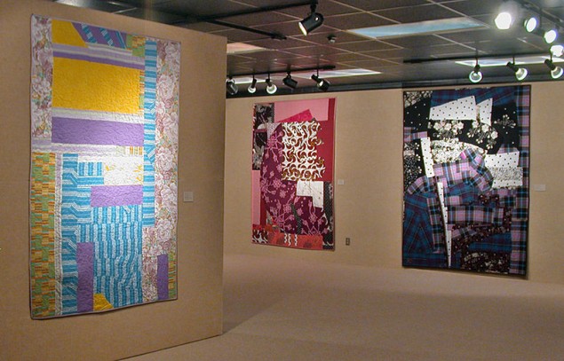
A design that depends upon the contrast rather the similarity of visual elements is asymmetrical and informal. Objects, lines, colors and shapes of different values and sizes have equal visual weight without being the same. These quilts by fiber artist Radka Donnell are asymmetrical in design:
Visual weight is an important element of asymmetric balance. Some factors that affect the visual weight of an object include:
• Position: Elements farther from the center of the design have more weight than elements at the center, so a larger central object can balance a smaller, outer object.
• Size: Larger things look heavier.
• Texture: A shape with texture has more visual weight than one without texture.
• Isolation: An object by itself draws more attention than one among many.
• Value: Darker tones are weightier than lighter tones.
• Quantity: Several small items can balance one larger item.
• Orientation: A diagonally oriented element has more visual weight than a vertically or horizontally oriented element.
• Shape: Simple shapes appear lighter than complex shapes.
• Color: Bright, vivid colors are visually heavier than lighter, muted colors.
Asymmetrical designs are generally more complex than symmetrical ones but often hold your interest longer because they require extra attention to identify their balance.
By understanding balance and its importance in design, you improve your ability to appreciate and interpret what you see. If a design or an artwork makes you feel uneasy, its lack of balance may be one important reason. Conversely, if you achieve a sense of completeness, calm and contentment while viewing a design or work of art, balance is a key contributing factor.
Today’s Activity for Kids: Weigh the Elements
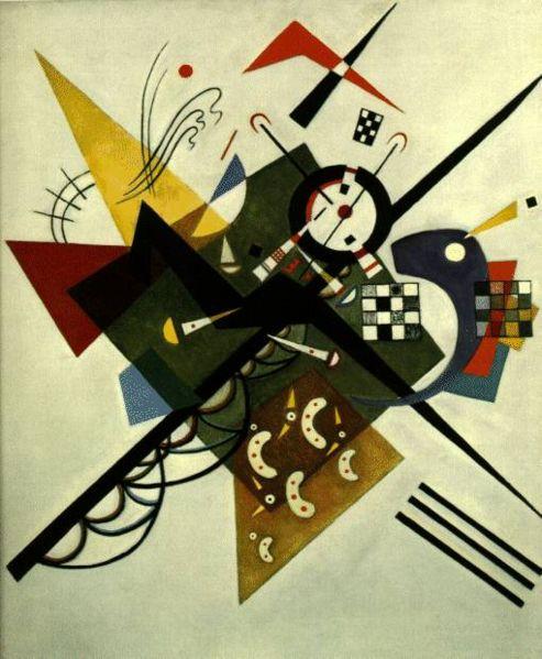
Answer the following questions for the artwork above, entitled “On White II,” by Wassily Kandinsky.
1. Is the artwork symmetrical or asymmetrical?
2. Does it look balanced?
3. What types of balance can you identify: vertical, horizontal, radial or crystallographic?
4. Look at the following elements of visual weight and describe how they help balance this design:
a. Position
b. Size
c. Isolation
d. Quantity
e. Orientation
f. Shape
g. Color
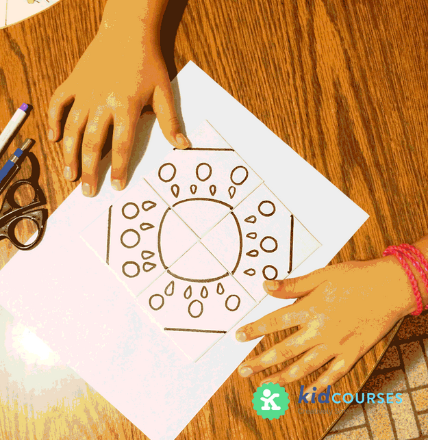
For a fun project involving symmetry, try out this fun, offline, Kaleidoscope Tiles craft:
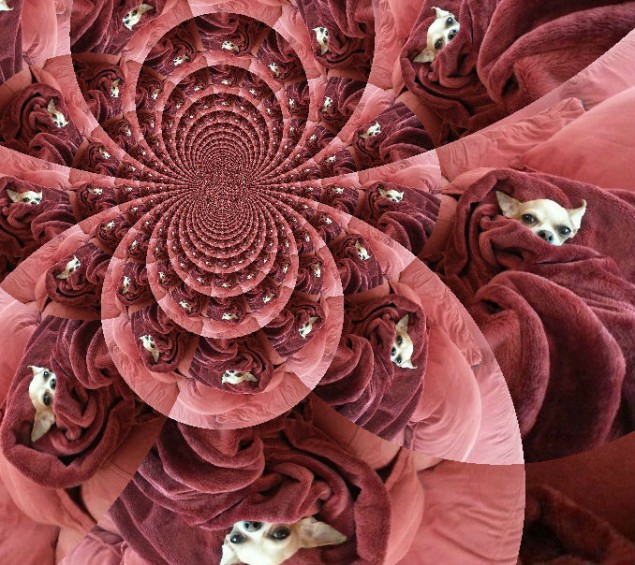
You can also try a fun, online, Kaleidoscope project!
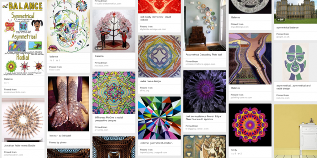
We also found a cool Pinboard on Balance by Jennfolds5:

