Principles of Design: Hierarchy
Arranging components in a hierarchical order is one way that the designer communicates with the viewer. Like unity and balance, hierarchy appeals to your instinctual search for relationships between the objects in an artwork or design. Seeing the order in a design helps you understand the overall meaning. The designer provides visual cues that guide you. Whether you are looking at an illustration, a work of art or a web page, the arrangement of the components in the design should effectively indicate levels of importance and meaning.
Visual Clues
The concept of hierarchy is based on the theory of Gestalt, which explains how humans naturally group individual elements into patterns. By making particular elements stand out, the designer communicates their importance and how you should see them. He or she uses visual tools to do this, including:
- Color
- Contrast
- Texture
- Size
- Shape
- Alignment
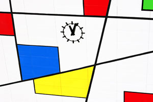
The boldest and most vibrant colors attract your eye before the paler, more sedate hues. Red, yellow and orange capture your attention immediately while light blues and greens are less captivating. Therefore, the designer uses bolder tones to highlight important elements that you should notice first.
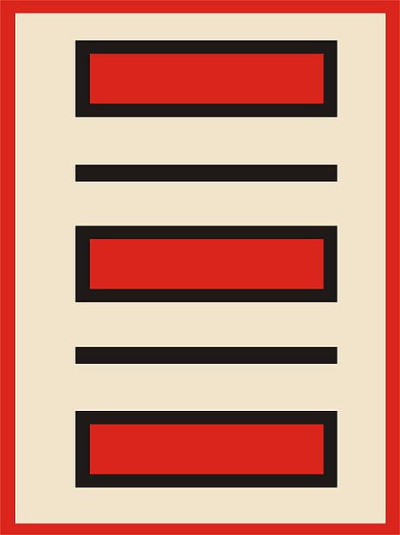
In this Kelum design by Pavle Cikovak, you are likely to first see the red rectangles, then the black lines and then the beige background.
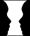
In a gray scale design, defining the more important elements by contrast communicates hierarchy. For example, a dark gray object attracts your attention before a lighter gray object. In this black and white design, you probably see the black silhouettes before you see the white silhouette.
An element that has texture is more noticeable than a similar one with a smooth surface. For example, if the design contains several circles, those with pebbled textures draw your glance before those without texture.
Larger things are more visually attractive than smaller things. If you are looking at a picture of three yellow flowers, the largest sized flower will be the first one to catch your eye. Keep in mind, however, that designers may manipulate your tendency to single out larger sized objects by giving a smaller one a more vibrant, eye-catching color.
Designers use shape to denote hierarchy as well. If you were viewing a design with eight shapes arranged in a rectangular pattern, seven of them circles and the eighth a square, you would naturally single out the square as the most important object. In non-symmetrical designs, you naturally group objects with curved edges or sharp angles, so a component that contrasts with these would claim more importance in the hierarchical order. In some cases, color and shape vie for prominence, as in this abstract design:
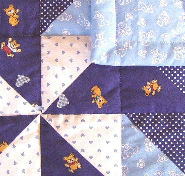
If a design had seven squares arranged in a row and the eighth square positioned above the row, you would see the misaligned square first. In a photograph showing a crowd of people all looking in one direction and just one person looking at the camera, you would see that person first. On a web page, designers may use different text alignment, such as a bulleted list, to offset a particularly important concept. Changing alignment also helps hold your interest since your mind seeks to identify differences and assign them a hierarchical meaning.Designs that lack apparent hierarchy also have visual purpose. For example, many calico fabrics in quilts work well with others because they do not claim dominance with vibrant colors or large patterns:
Camouflage designs are also intentionally non-hierarchical because their purpose is hiding things rather than bringing them to your attention. When soldiers wear camouflage, they minimize the differences between themselves and their surroundings: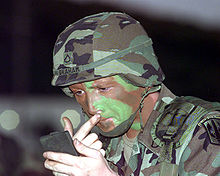 Should the solider add a dot of yellow to his helmet or leave a square of white on his cheek, he would immediately make himself easier to spot amid the foliage.
Today’s Activity for Kids: Evaluate the Illusions
Look at the following designs and describe what you see on first glance. Then, try to explain why in terms of color, contrast, texture, size, shape or alignment.
1. Kanizsa triangle

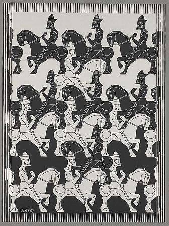
2. M.C. Escher: Regular Division of the Plane III
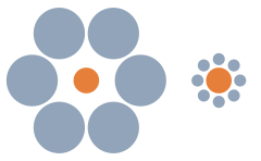
3. Ebbinghaus Illusion
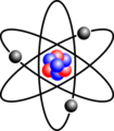
4. Diagram of a Lithium Atom