Principles of Design: Scale and Proportion
Scale and proportion are both design elements that have to do with size. Scale is the size of one object in relation to the other objects in a design or artwork. Proportion refers to the size of the parts of an object in relationship to other parts of the same object. Throughout the centuries, designers have used scale and proportion to depict or distract from the ideal. As with elements such as unity and balance, artists use scale and proportion to convey their unique insights to the viewer.
Scale
Humans judge the scale of something according to body size. Some of the most common adjectives that apply to scale include:
• Life-sized
• Miniature
• Oversized
• Enormous
When an artist or designer chooses to make particular objects oversized or miniature, it is often to emphasize their importance or encourage a new perspective.
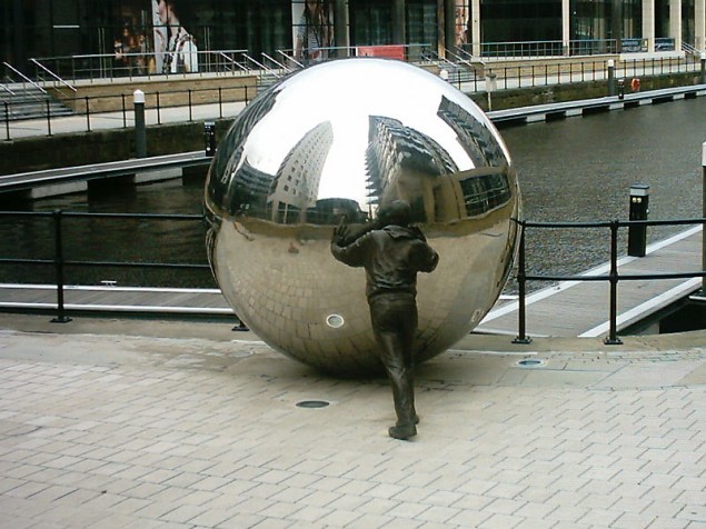
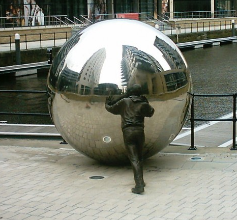
In the above public artwork, the person pushing the sphere provides a sense of scale. Given the reflections of skyscrapers in the sphere, viewers might infer that the globe symbolizes the world, and its relatively small scale suggests that humans can manipulate it.
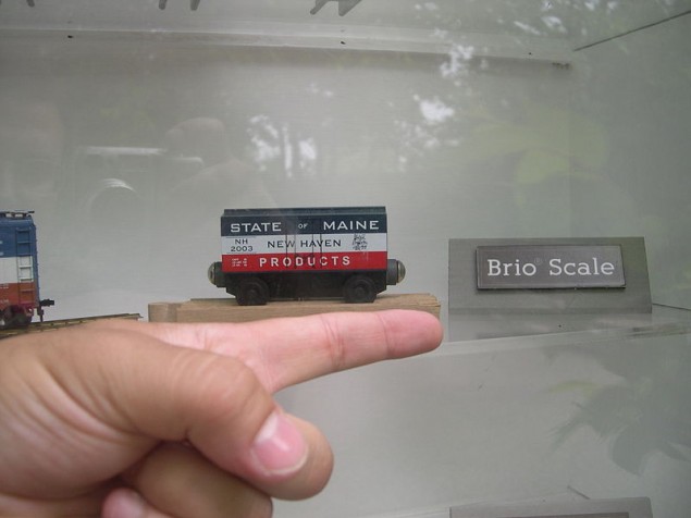
Some toys are miniatures of actual objects. For example, scale model cars, trains and dollhouse furnishings replicate real objects on a smaller scale. In the photo below, the man’s hand gives you a good idea of the actual size of the toy rail car. Scale model toys give children the power to manipulate realistic objects that are otherwise too big for them to manage.
Proportion
Proportion is an element of design that pertains to the relative size of the components that compose an object. Again, the human body is the standard by which people judge proportion. An eye should be smaller than a face, for instance, and a male’s shoulders should be wider than his hips.
The golden ratio is a mathematical method for determining proportion. Based on the number pi, this ratio has been the standard for artists and designers since the ancient Egyptians used it in designing the pyramids. Also, the golden ratio is applicable to the natural proportions of the body. The more closely a person’s proportions conform to this ratio, the more classically beautiful they are likely to appear.
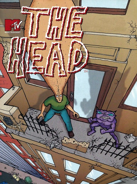
When you see a disproportionate object, it catches your attention. Cartoons with large-headed people, for example, catch your eye. Obvious exaggeration may even tickle your funny bone. “The Head” by Eric Fogel is a good example:
In Greek mythology, monstrous characters like Medusa had disproportionate traits that set them apart from humans. Instead of hair, Medusa had poisonous snakes growing from her head, as the artist Caravaggio shows below.
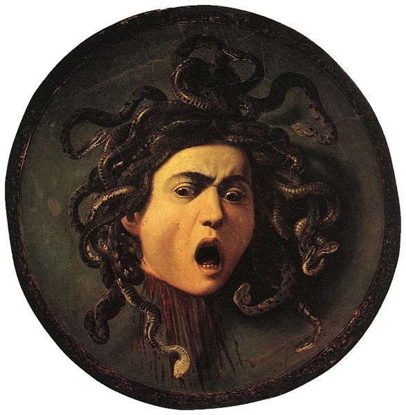
Giving human figures non-human components makes them disproportionate. Like a cartoon, something disproportionate can make you laugh. Like Medusa, it can inspire fear.
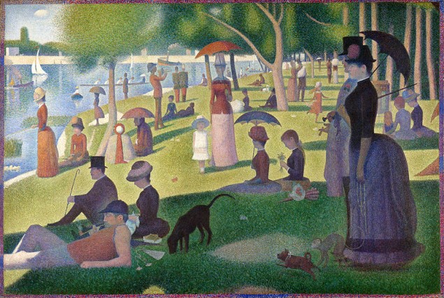
In contrast, an artwork in which all of the figures are proportionate can make you feel calm and content. Rather than challenging your emotions, proportion infuses you with a sense of completeness. Georges Seurat’s “A Sunday on La Grand Jatte” shows stylized people, all well-proportioned and on the same scale, relaxing on a sunny afternoon. Even though there are variations of light and lots of activities to look at, the overall effect is serene.
Today’s Activity: Make a Scale Drawing
Supplies:
Plain, 8 x 10 paper
A picture of your favorite cartoon character that is at least 10 inches tall
Ruler
Pencil
Scissors
Markers, paints or colored pencils
1. Lightly draw a grid with pencil over your cartoon print. Mark 1-inch lines all along the perimeter of the page, and then connect them across the page to make a grid of 1-inch squares.
2. Number the squares on your print, starting at the top left and proceeding from left to right from the top row to the bottom row.
3. Draw a grid on your plain paper. Mark 1/2-inch intervals along all four sides, and then connect the marks to make a grid of 1/2-inch squares. Your scale drawing will be 1:2, or half the size of the original.
4. Number the squares on your plain grid the same, duplicating the number of squares and rows of the original. Cut off the extra squares and set aside.
5. Copy the design onto your blank grid, going square by square. Try to match the straight lines and curves within each square on the original to make your smaller scale drawing as similar as you can.
6. Use markers, paints or colored pencils to color in your scale drawing like the original.
Use your extra grid to experiment with proportion. For example, make one eye of your cartoon figure twice as large as the other. Make one hand tiny and the other large. What effects do your changes have?
