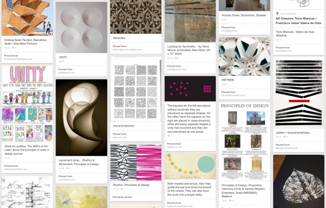
Principles of Design: Unity
Unity results when all of the principles of a design merge into a complete work of art. It encompasses line, shape, form, color, texture and space. Harmony is the way in which all of the elements relate to one another to successfully produce a unified whole. In a successful design or artwork, the unity of all elements is greater than all of the parts combined.
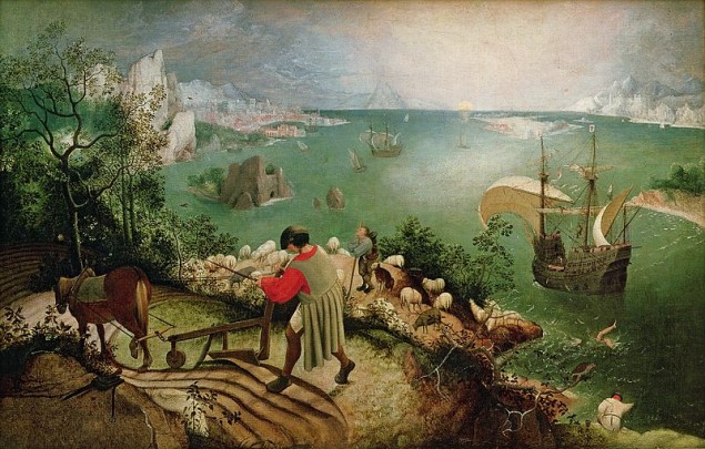
By organizing visual elements into a unified whole, the artist conveys intent. For example, in Pieter Brueghel’s Landscape with the Fall of Icarus, all of the activities going on despite Icarus’ fall illustrate the single event’s relative unimportance in the greater scheme of things. If the painting focused instead on the boy’s legs kicking, you would feel much more concerned about his fate. However, no one else in the painting is even glancing at the boy in the water. This is how the artist communicates his intent.
Some of the ways that a designer or artist achieves unity include:
• The use of similar shapes
• The use of similar patterns
• Harmonizing colors
• The use of space
• The use of a single background
In the Icarus painting, all of the green tones harmonize to create a sense of calm that the curved shapes of the sails, the sheep and the coastline echo. Distant, craggy peaks add a suggestion of danger, but they are far away from the serenity of the foreground. These elements together communicate the artist’s suggestion that the world is removed from the small drama of a boy falling from the sky.
According to the theory of Gestalt, viewers naturally seek unity in designs. Have you ever looked up at the clouds in the sky and tried to “see” objects in the clouds? People’s minds instinctively group elements together in the effort to make sense of a piece. Making sense leads to a more complete understanding of the piece as a whole than just the sum of its parts. Some of the ways artists group the components of a design include:
• By proximity: Placing items together or far apart is a way of showing their relationships. In the Icarus painting, all of the mountains rising to great heights are in the background while all of the living beings are in the foreground. The distance of the sun in the painting from human activity reinforces the concept that the distance between the heavens – where Icarus tried to fly – and the earth – where humans belong – is vast.
• By similarity: Using like objects reinforces a theme or concept. For example, all of the human figures in the painting are grouped in the foreground. All of the mountains are grouped in the background.
• By continuation: The continuation of an element throughout the design conveys an overall idea. The continuation of the water from the lower right corner of the Icarus painting, where the man is fishing, to the horizon, where the sun is setting, unifies the entire scene.
• By alignment: Arranging similar elements side by side reinforces their connection. The alignment of the plowman’s tunic pleats and the furrows in the earth illustrates an essential unity between human and earth that comments on the folly of Icarus’ attempted flight.

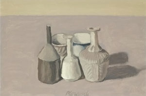
Elements of disharmony within a design create dramatic tension that conveys excitement and other strong emotions. A painting that is too harmonic, like the still life scene by Giorgio Morandi above, is pleasing but lacking in power.
In the Icarus painting, the contrast of the peaceful pastoral activities going on in the foreground with the kicking legs of Icarus in the water creates drama. The fact that only the viewer outside the painting is watching the boy drown while those within the scene look elsewhere is also a source of dramatic tension. This effectively draws the viewer in.
One important reason that the unity of an artwork is larger than all the elements within it is your perspective. As a viewer, you provide the perception that unifies what you see in a way that brings completion – and understanding — to the artwork.
Today’s Activity for Kids: The Sum of the Parts
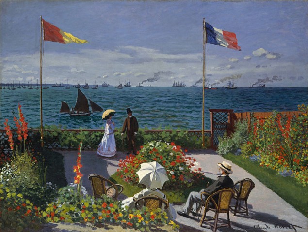
Look at this artwork by Claude Monet and identify the unifying factors, including:
• Similarity
• Use of space
• Use of color
• Proximity
• Continuation
• Alignment
How would you describe the artist’s intent in painting this scene?
For some art ideas, check out Valerie Goodwin’s Pinboard on the Principles of Design.

