Principles of Design: Dominance and Emphasis
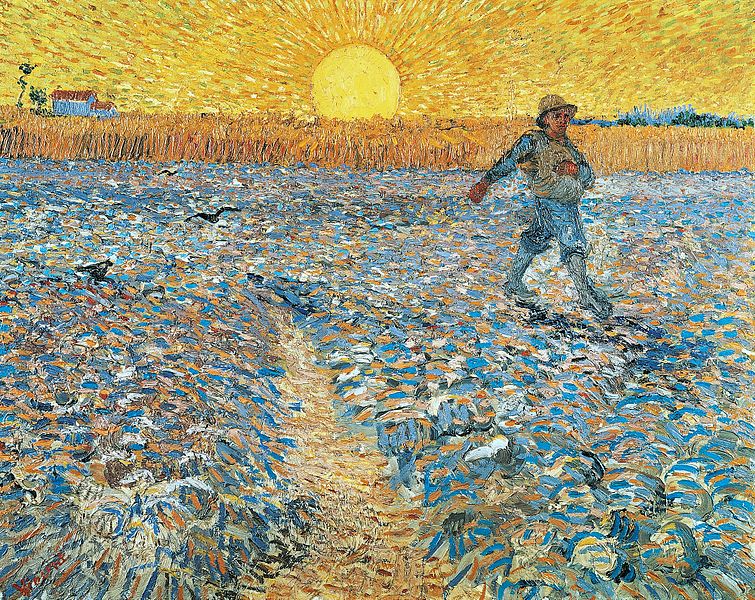
In many dynamic designs and artworks, one dominant aspect is the first to claim your attention. Known as a focal point, it provides you with a way to access the page or the canvas. Once you are “in,” you can look around, making instinctual connections between pieces to get a sense of the unified whole. The artist puts greater emphasis on one part of the overall design to communicate a specific intent or a primary reason for creating the work.
A focal point is the center of the action. The three primary tools the designer uses to emphasize dominance are:
• Contrast
• Placement
• Isolation
Aspects of Contrast
Contrast is a design property that defines elements by making them look different from other elements. The more items contrast, the more visible they become. Artists employ different design features in creating contrast.
Color is one tool for showing contrast. The designer might set a vivid color against a dull background. In “Sower at Sunset” (below), Vincent Van Gogh gives dominance to the sun, which is a brighter yellow than the corn stalks and poses a stark contrast to the cool blues of the figure and the landscape.
Another aspect of contrast is size. In general, larger objects are more noticeable than smaller ones. In Van Gogh’s painting, because the sun is larger than the man’s head and the farmhouse, it dominates the scene.

Shape also creates emphasis by contrast. The sun in this painting is the only fully round object while the pathway, the stalks and the building are angular. The man’s hat is curved, indicating that, like the sun, he is important in the scene.
Texture is also a way to create dominance. In “Sower at Sunset,” the sun is the only relatively smooth object. It draws your eye away from all of the highly textured elements in the picture by virtue of its difference. By giving the setting sun dominance in this painting, the artist illustrates its power over the earth and its inhabitants.
Placement Considerations
The placement of elements in a design is another way to denote the dominance of one particular component. Typically, the center of the design is the first place you look. As elements move away from the center, they become less and less dominant. The rose window at the Notre Dame cathedral in Paris illustrates this central dominance in design.
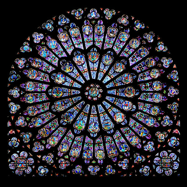
At the middle of this stained glass window is the Madonna and Child, central figures of the Christian religion. Prophets and saints occupy the concentric outer rings, illustrating their lesser importance.
Isolation for Emphasis
Something that stands apart from other objects in a design has more emphasis. Besides using tools like color, shape and placement to show dominance, the designer may choose to further isolate the dominant part of the design. For example, in “A Room of Illusions III, artist Alan King places the dominant aspect, the white sphere, in the center of the scene. He isolates it by giving it a unique color and shape, and also by placing it on a pedestal by itself.
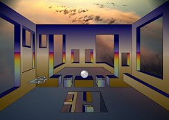
By positioning the second most important components near the dominant one, the designer tells you where to look next. Sometimes, the shape of the object points the direction your eye should follow. In this painting, the geometric shapes in the foreground seem to point toward the sphere.
Identify the dominant component in each of the works below. What does dominance indicate about the artist’s intent?
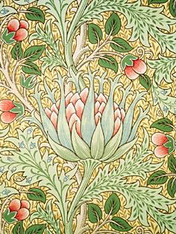
“Artichoke,” a wallpaper design by John Henry Dearle

“Painting #576” by David Reed
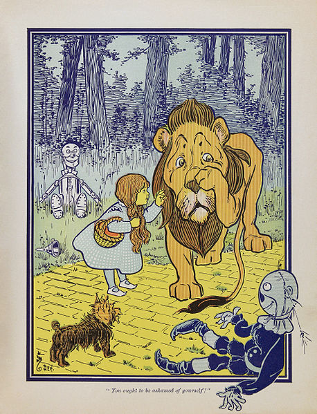
“Dorothy Meets the Cowardly Lion” by W.W. Denslow
Dominance in a design or painting is both a portal for the viewer and a way the artist communicates meaning. Contrasts put emphasis on particular parts of the design. Placement indicates the dominance of a component, and isolation sets it apart.
Today’s Activity for Kids: Photo Montage
Supplies:
Magazines with photos to cut out
Large flat background sheet
Glue
1. Locate a dominant image for your design. Choose a photo of an object that has a vivid color and a distinctive shape, and cut it out along its outline.
2. Cut out several secondary images that are less vivid than the dominant image and contrast with it in terms of shape or texture.
3. Find some background photos. They should not be as bright in color as your dominant or secondary images, and they should contrast in tone. They should not have a shape that is similar to the dominant or secondary images.
4. Arrange your background so that it covers the flat sheet of paper. Then, place your dominant image near the center to emphasize its importance. Experiment with various placements of the secondary images to best direct your viewers around the design.
