
Visual Rhetoric
Visual rhetoric communicates themes and ideas through images, color and text style. Art, display ads and web pages can all convey visual rhetoric. It is similar to spoken or written rhetoric in its use of specific conventions to communicate, convince, caution or critique. It can be:
• Informational to educate
• Inspirational to encourage
• Motivational to incite action
• Functional to explain how something works
Strategies of visual rhetoric include:
• Selection of typography to communicate meaning
• Choice of colors to emphasize themes
• The use of images to support an argument
• Composition to capture attention
Heading and Text Fonts: Finding the Right Type
Some styles of type are utilitarian. Some are attention grabbing. Although it’s fun to experiment with all the zany styles of type available, when you design a visual project, you should choose your fonts carefully to achieve your goals. Your first consideration is your audience. If they are business professionals, a type style like Times New Roman or Arial is a logical choice: 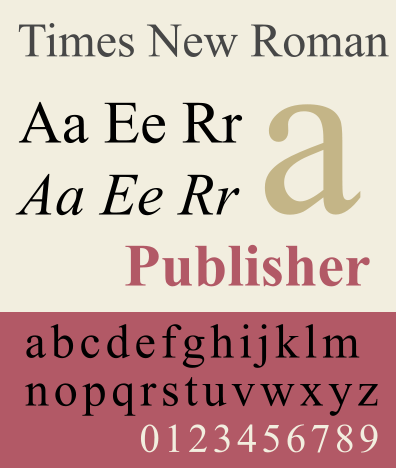
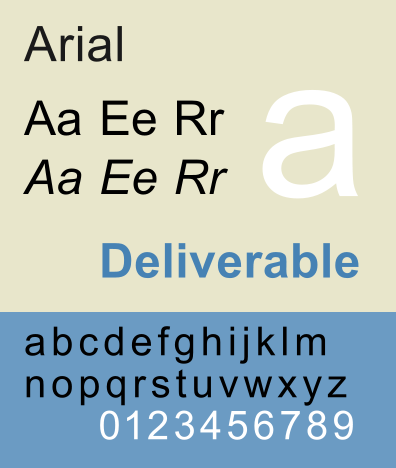
Both fonts are simple, straightforward and easy to read. Alternatively, if you are communicating to classmates, a slightly stylized font like Display (shown below) provides a touch of attitude. 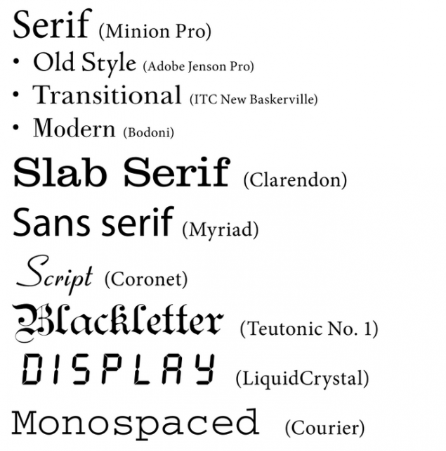 In visual rhetoric, the choice of an unusual text font not only affects readability but also may prevent your message from getting through at all if the audience finds it too distracting. You can get somewhat more creative with the fonts you choose for headings or headlines, but always keep readability and continuity in mind. Serif fonts have extra strokes at the ends of the letters and are great for reading printed material. San serif fonts do not have extra stokes on the ends of the letters and are easier to read on screen.
 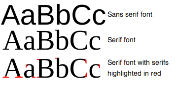 Our brains do this cool thing whereby we get used to the shape or “word forms” of the words we see, and words that are written in lower case are easy to recognize – we read them faster. Upper case can be used for short titles, for example, when you want to emphasize a word. But note that studies conducted by Colin Wheildon in the 80’s and 90’s concluded that headlines set in capital letters are significantly less legible than those set in lower case.
In addition to reduced readability, when uppercase is used to construct the main body of text, it is perceived as “shouting” (or should I say SHOUTING?).
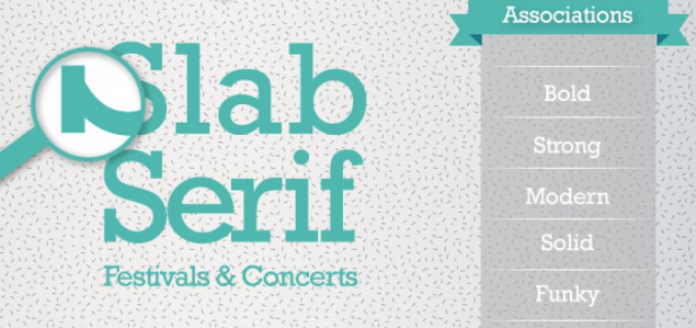
If you were, say, creating a poster for an music event, you could benefit from using a slab serif font, as these are associated with being funky and modern. Check out this infographic on the Psychology of Fonts.
You can also emphasize certain words or phrases by making them bold.

Maybe you want to make your word bigger, bolder, or emphasize it with color… This brings us to the next topic: Color.
What Do Your Colors Convey?
Although dozens of considerations go into selecting rhetorical colors, your primary focuses should be contrast, saturation and psychological impact. Because color is key to conveying meaning, choose your hues (a fancy word for the actual name of a color) wisely.
Consider Your Text
Contrast describes the way two colors offset each other. While royal blue and navy blue contrast just a little, black and white contrast quite a bit. The better the contrast between your text, images and background, the more powerfully they will convey your meaning.
Consider the phenomenon of simultaneous contrast. Here, the small gray rectangles inside the larger rectangles are the same exact shade of gray.

Think about how strong the contrast is between your text and background, and if you are visually creating the desired effect.
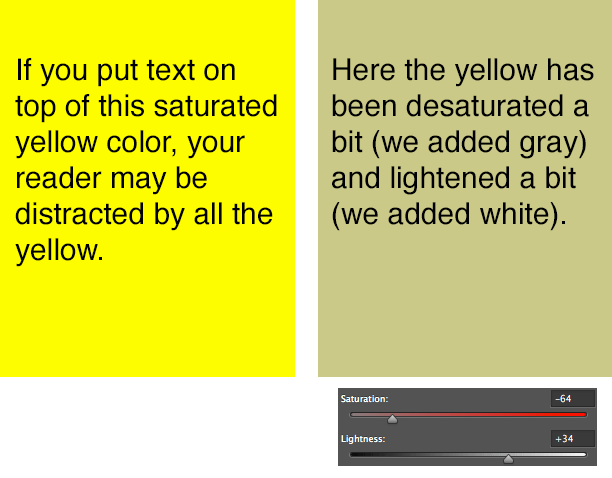
Saturation is another critical element of color. A bright, lemon yellow has more saturation than pale, mustardy, yellow. While highly saturated colors are certainly attractive, too much vibrance is liable to distract your viewers from your ultimate meaning if you force them to read text on a highly saturated background. In many cases, but not always, more muted tones convey your meaning best and provide for legibility. A saturated color is your hue (the actual name of your color, for example, yellow) with no gray added. As you desaturate your hue you mix in gray.
Consider Your Overall Color Scheme
Colors evoke strong emotions, and you can use their psychological impact on your viewers as a visual rhetoric tool. The vast majority of campaign posters, for example, are based on a patriotic palette to create the impression that each candidate is dedicated to serving the country. The colors you select should reflect your topic and the impression you want to convey. You might choose earth tones for an environmental theme or vivid colors for a site on flower gardening.
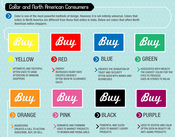
View an infographic on the Psychology of Color.
Note that the infographic above accounts for color psychology for North Americans. Another consideration is, color symbolism, which is dependent on culture and can bring about more associations. For example, white can be used to represent purity, peace, or innocence in some cultures. But, in some places (like Japan), the color white signifies death.
Polishing Your Image
The visual images you use should clearly provide information, illustrate your main objectives or help win over your audience. Any images you use must confirm your credibility. Visual images consist of:
• Graphs
• Charts
• Drawings
• Photographs
The graphs and charts you include should effectively support the argument you are making. For example, if you claim that one country creates more solid waste than any other, incorporate a pie chart that graphically illustrates the percentage of waste different countries produce.
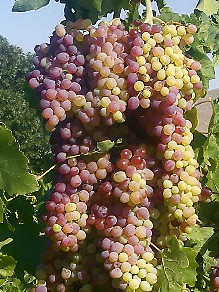
Which grape image below – the scientific diagram or the colorful photo — makes you hungry?

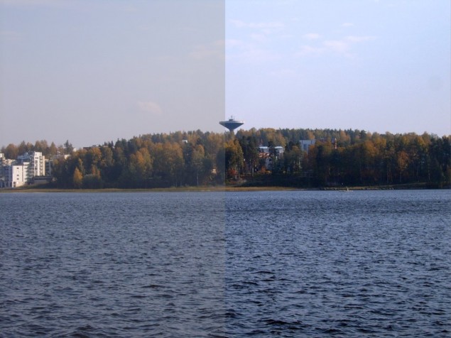
Your photos and drawings should convey at least as much as your text in terms of proof. To be most effective, they must be eye-catching, sharp, and clearly applicable to your message or theme. The image below shows a split screen view of different contrast levels:
Photos shot from above will make the human subject look weak, while those shot from below will make the subject look powerful. For example, in Star Wars, many times they filmed Darth Vadar from a low angle to make him appear more powerful. Here is an example of a photo shot from above. How do you perceive this little boy?

Composition: Putting It All Together
Once you have selected your visual elements, arrange them on the page for maximum impact. Provide viewers with an entry point, such as a captivating headline or image, and then lead them through your treatise using the visual cues of font style and size, color and images. At first glance, the page should create a spark of interest. Each aspect of your visual appeal should be compelling enough to maintain that interest until your argument is complete. Often, a powerful image and a few words conveys meaning best, as in the World War II poster below:
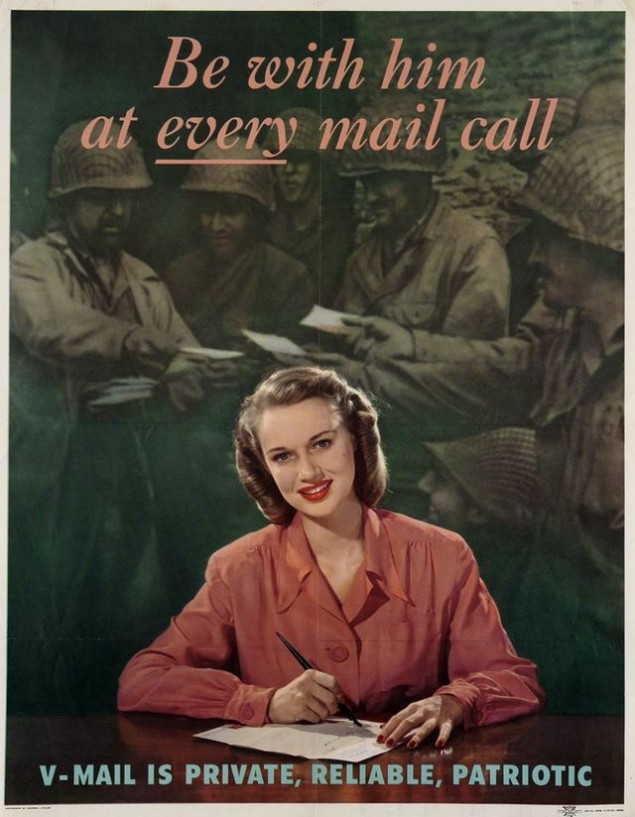
Notice the use of muted reds that focuses the message. The white makes the envelopes stand out and links the letter on the desk with those that the soldiers are holding. The italic font on top looks somewhat like handwriting and reinforces the theme of the poster. The lettering below is plain and official looking, like the military.
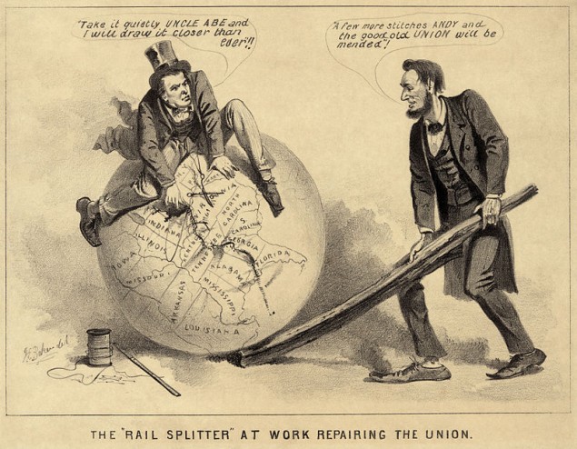
Visual Rhetoric Activity
Select one of the options below and explain how the artist uses elements of visual rhetoric to make a strong argument. Discuss text font and sizes, color, images and composition, as well as any additional components that contribute.
1:
2:
3:
Recommended Video:
We recommend watching Visual Rhetoric by Purdue Owl.