Elements of Design: Space
Space is an element of design that occurs around and in between the forms, shapes, colors and lines. It provides perspective, dimension and volume to a flat page. The techniques an artist uses to create space include:
• Sizing
• Overlapping
• Composition
• Linear Perspective
• Color and value
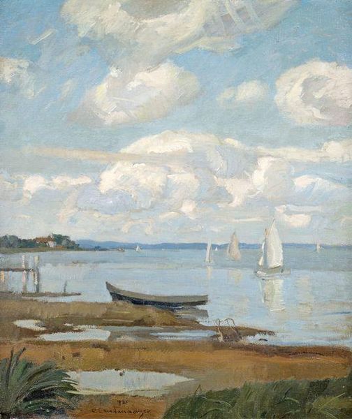
By sizing objects according to their distance within the picture, the artist depicts depth. For example, in the painting below, artist Christian Landenberger paints his sailboats smaller and smaller to illustrate distance:
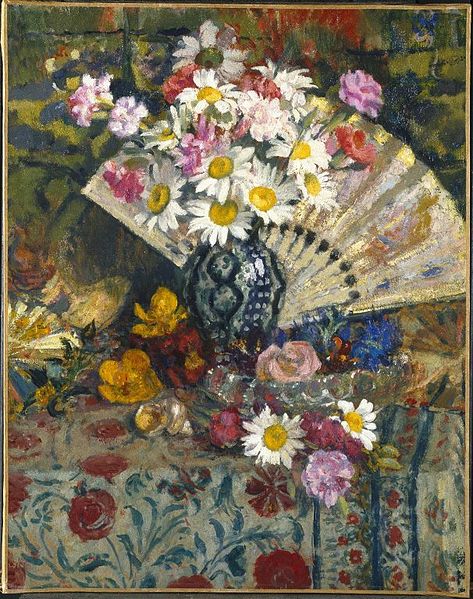
Overlapping is another space-creating tool. An object that overlaps others is in the forefront while overlapped items appear to be farther away. In his “Still Life with Fan,” artist Georges Lemmen overlaps the fan with the flowers that are at the forefront of the space.
Composition also helps create three-dimensional spaces. It relies on the vertical positioning of objects to suggest depth. Those items that are located at the bottom of the artwork are the closest to the viewer while items higher up on the page are farthest away. In the sailboats picture above, the sand is at the bottom of the painting while the clouds are at the top.
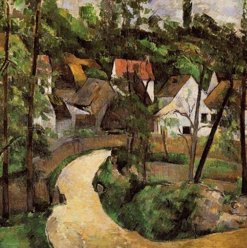
Linear perspective tricks your eyes into seeing space within a flat surface. It is based the way you see parallel lines. For example, as train tracks extend into the distance, they appear to get closer together. In “A Turn in the Road,” Paul Cezanne’s parallel lines are the edges of the roadway.
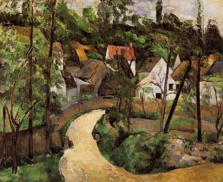
The color and value of objects also affect space. In general, closer items are darker and warmer in color while faraway things are lighter and cooler. By combining several of these techniques, artists create distinctive, three-dimensional spaces that invite you to step into the scene and take a look around.
Space in Crafts
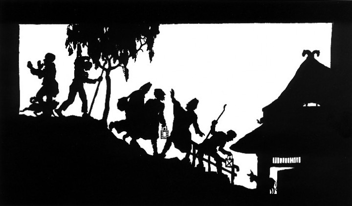
Papier découpé de Wilhelm Gross
Scherenschnitte (“scissor cuts”) is a traditional German paper cutting craft. Different design techniques give the flat design dimension. In the paper cut pictured, the composition indicates dimension with the grass at the bottom and tree branches at the top. Also, people and animal forms overlap each other.
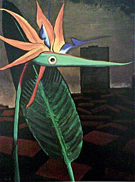
Collage art mainly relies on overlapping of different shapes to create depth. In this collage, “ManRayMisunderstood,” the artist also uses color and value to show the nearness of different objects. Note how the dark building is the farthest away, and the brightly hued flower creature is closest.
Today’s Art Idea for Kids: Bird Collage
To make a bird collage, you will need scissors, magazine pages, construction paper, a heavy background paper and glue. You can use this real photo as your inspiration:
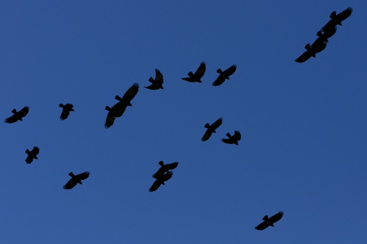
- Design a backdrop for your collage. You could draw it or paste magazine cuttings to the heavy paper.
- Cut several triangles, circles, ovals, squares and rectangles of different sizes from your magazine pages and construction paper.
- Experiment with laying them out in one or more bird designs on the background paper, overlapping shapes to suggest depth in the space. Size the birds differently to show perspective.
- Glue each piece onto the page.
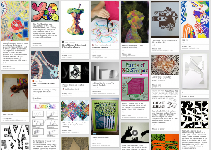
For a fun Pinboard on Space & Shape, check out Karie Winfree’s board!

