Principles of Design: Similarity and Contrast
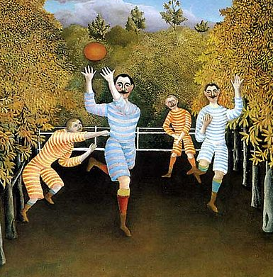
Similarity and contrast are two tools that a designer uses to attract viewers and shape how they their perceive the design. By using similar colors, shapes and sizes of objects, the artist suggests they are alike. This similarity gives cohesion and a sense of completeness to the design. Elements that contrast with other objects stand out and draw your attention. They supply energy and attraction, sparking interest and, perhaps, excitement.
Similarity Provides Structure and Stability
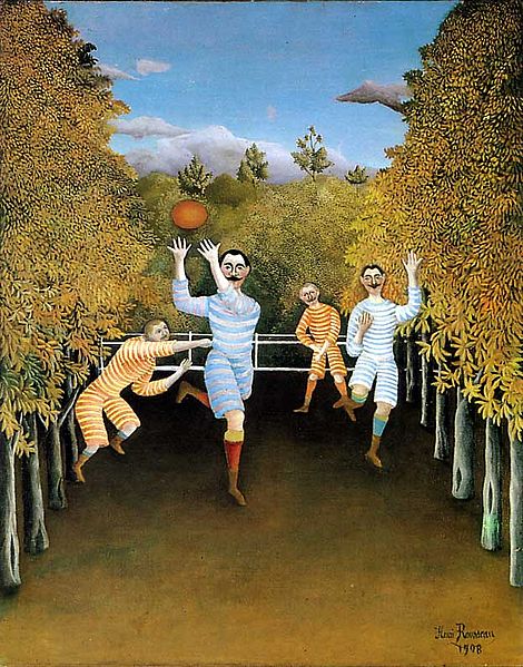
Similarity in design creates relationships that communicate meaning. You may recognize similar colors, shapes, textures, sizes or orientation. For example, in Henri Rousseau’s painting, “The Football Players,” the artist identifies teammates with similarly colored uniforms. He directs your eye into the game by framing the playing field with foliage that all looks alike. The similarity stabilizes the action within the framework, making it seem safe and contained.
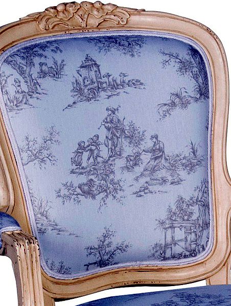
Fabric designers often repeat motifs to create attractive designs. For elements that should blend into a room, such as chair upholstery or window curtains, interior decorators choose solid fabrics or those patterns with similar shapes and colors in their designs. These similarities make you feel relaxed and comfortable. French toile fabrics are a good example. Even though toile figures can be quite detailed, they lack the distinction of contrasting colors, and as a result, they do not demand your attention.
Too much similarity does not hold your interest for very long. For example, when you are faced with a block of text on a page, your mind may begin to wander. However, if the page includes an illustration, a chart, or any other contrast to the text, it is more likely to keep your attention longer.
Contrast Piques Your Interest
The first time you see a design or an artwork, you naturally focus on something out of place. It may make you feel unsettled or intrigued. The person who created the contrast did so to communicate with you. In the artwork below, entitled “New Chances for World Decay” by surrealist William Girometti, several contrasts provide clues to the artist’s intent.
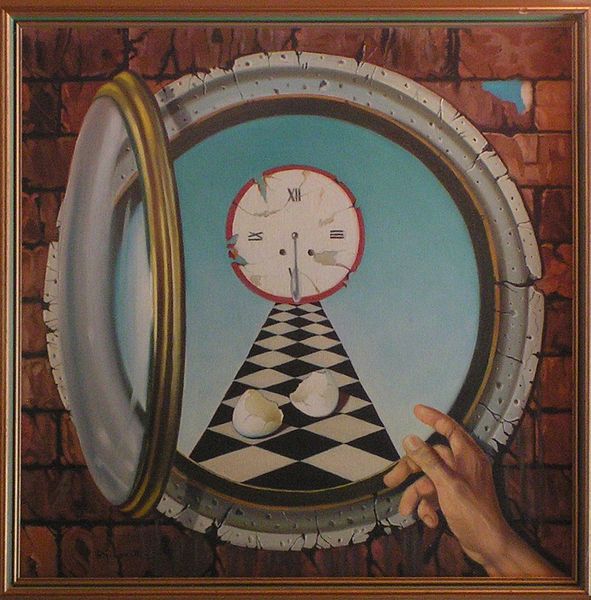
The red outline of the clock contrasts with its blue background and immediately draws your eye. The geometric shapes that line the pathway to the clock contrast with the spheres of the porthole and clock, again leading your eye to the clock. The shape of the cracked egg contrasts with the pathway and also attracts your attention. The shape, color and texture of the hand pointing to the clock contrasts with the bricks of the wall and the cement of the window frame. When you put all of these contrasts together, you see how they all work to draw your attention to the clock at the end of the pathway, reflecting the fact that from the time you are born – or emerge from the egg — you cannot escape the pull of time.
In some cases, the artist implies rather than illustrates contrast. Sometimes what you see conflicts with what you expect to see, and this creates a compelling attraction.
Surrealism, a movement that dates to the 1920s, specializes in the element of surprise. Many artworks depict nonexistent creatures or objects in the midst of realistic scenes, contrasting the dream world with the real world. In the artwork below by William Girometti, the fanciful chair/woman contrasts sharply with what you expect to see, and yet the piece of furniture, the strand of pearls, and even the wig on the chair are realistic and ordinary.
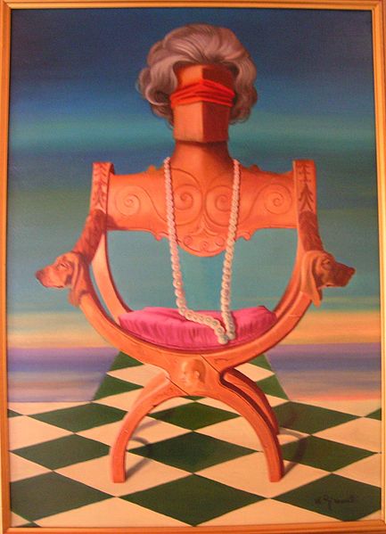
The blindfold is the only red object in the scene. Thus, it is important to the artist’s concept. Perhaps he is implying that the type of woman in the artwork is both rigid like a piece of furniture and blind.
Graphic designers often use contrasting font colors, backgrounds or different sizes of type to place emphasis on particularly important parts of a page. Interior decorators may furnish a room around a statement piece that stands out from the rest of the furnishings and sets the tone for the decor.
While contrast is stimulating, similarity has the opposite effect. Both are useful tools for creating a scene, an impression or an overall setting. They work well together to unify and define a particular theme. On their own, each has little power to hold your attention or pique your interest.
Today’s Activity:
Create a poster advertising your favorite activity. It could be anything from playing sports to reading a book. Your poster should have a background with similar colors and shapes, and a primary illustration that contrasts with other elements of your design. You can also use contrast to draw attention to blocks of text that highlight the key benefits of your activity. Make sure you use similarity and contrast together to draw your viewers in and direct them around your poster.
Contrasts that you might want to play with:
- Form (read more about form)
- Simple verses Complex
- Direction
- Stability verses Movement
- Color (read more about color)
- Grayscale verses Color
- Light verses Dark
- Texture (read more about texture)
- Fine verses Coarse
- Smooth verses Rough
- Sharp verses Dull
- Density
- Transparent verses Opaque
