
Hands-On Typography Intro

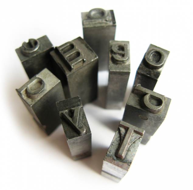
Typography: The Art of Letters
If you enjoy experimenting with type styles, you are probably interested in typography. A centuries-old creative art, typography is the arrangement of lettering on a page and includes:
- Selecting typefaces, fonts or lettering styles
- Choosing lettering sizes
- Line spacing
- Letter spacing
- Color
Typefaces, Fonts and Lettering Styles
A typeface is the sum of all the capital and lowercase letters, numbers and symbols within a specific font family. A couple of common typefaces you may have seen are Times New Roman and Helvetica.Typefaces are divided into two primary groups: serif and sans serif. A serif is a sort of tail that finishes off a letter stroke. For example, the little lines that form the feet of a capital “A” are serifs. See if you can identify the serifs in the following example of the Times New Roman typeface:
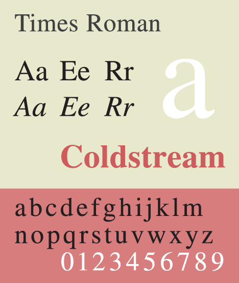
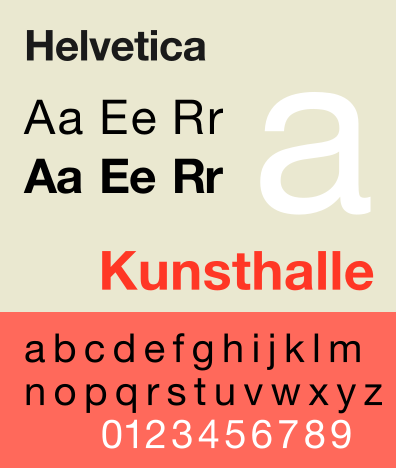
Serif typefaces often project a formal, authoritative image that makes them ideal for newspaper and book text. Their slightly decorative look instills the text with subtle style.A sans serif typeface, such as Helvetica, features clean lines with no distracting flourishes. Some people may find these fonts more readable than serif lettering and prefer their plain, no-frills appearance, especially on a computer screen:
When you select a fonts for a project, keep readability in mind. Readability is a measure of how easy it is to read. In general, blocks of copy consisting of all italic letters are not as readable as non-italics. A decorative font may be perfect for a greeting card but too ornate for a block of text. Legibility is another concern. What’s the difference between readability and legibility? While readability is concerned with how easy it is to scan and read paragraphs, legibility is looking at how easy it is to distinguishing individual letters. When selecting appropriate typefaces, try to strike a balance among readability, legibility and artistic style.
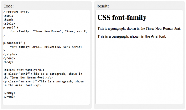
Try playing with Serif and Sans Serif fonts on W3Schools:
Getting to the Point: Letter Sizing
Typographers select the sizing of their text so it fits within a format, is easy to read and makes the desired impact. Newspaper headlines are larger than article text because they are designed to attract attention. Book text is smaller because all of it must fit within a specific, page-sized format.
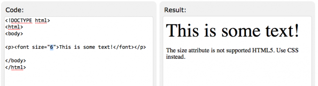
Typographers measure the height of letters in points rather than inches or millimeters. The point range for maximum readability is 4 to 40, which roughly translates to 1.4 to 14 mm in height. Reading speed declines when type is smaller or larger.
Try changing the 6 to another number in this TryIt Editor on W3Schools:
The Right Space: Lines and Letters
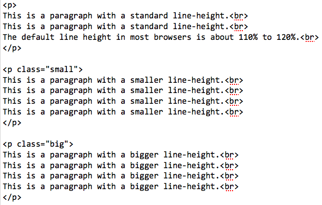
Another factor that affects the legibility of text is vertical line spacing. According to typographical research, the space between lines should be 120 to 145 percent of the lettering point size. For example, if you are using 12-point text, multiply 12 times 1.20 to get 14.4 points, the smallest distance between lines for optimal readability.
Try it for yourself on W3Schools right now:
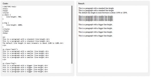
Notice where the class is shown as “small” or “big” and changes these around!
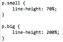
You can also look up at the top of the code and change what you mean by big and small based on changing the percents:
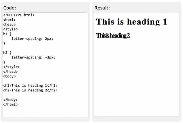
Letter spacing, or tracking in typographical terms, is also relevant to the readability of text. In documents with justified margins, some words are more widely spaced to make the margins even. In text with small lettering, roomier letter spacing helps with legibility. You can play around with letter spacing on W3Schools as well:
Color Considerations, Typographically Speaking
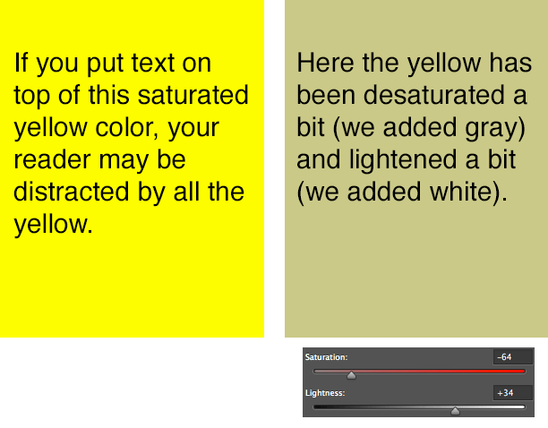
The professional typographer considers color to be the density of ink on the page. The layout of the text, the spacing of words and lines, the depth of the margins and the ink colors all contribute to color density. Often, a page with a balance of ink and white space is more inviting to readers.
Today’s Activity: Experimenting with Typography
Create a notice or handout that includes, in the order of your choice:
1. Headline(s)
2. Subhead(s)
3. 2-3 paragraphs of text
4. A quotation of several lines
5. A summary statement or call to action
Explain your typographical choices, including:
1. Fonts and type sizes
2. Letter and line spacing
3. Color
4. Readability
5. Message
6. Artistic value
We Recommend
Check out our post on Visual Rhetoric.